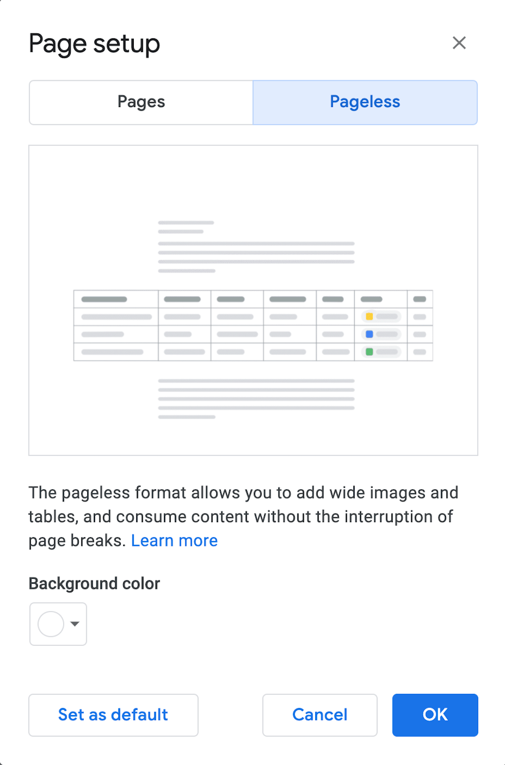
In February 2022, as promised at I/O 2021, Google added the option to remove pagination from Google Docs on a per-document basis. “Pageless” can be set as the default format for any new documents that a user creates.
Page breaks in online documents have several advantages. First, they provide a WYSIWYG for hardcopy printing or saving a Doc as a PDF.
Second, pagination has a referential function — “See the last paragraph on Page 6”.
However, having multiple pages often interrupts the flow of an on-screen document. For example, a page break can separate the descriptive text that’s above an image from the image itself. Pagination can separate rows in a table.
The pageless format makes documents behave more like a web page. Pageless Google Docs have a continuous scroll and they are responsive.
Pageless also allows for images and tables that are wider than the body text.
How to make a document a continuous scroll
In any document, from the File menu, select Page Setup and then click Pageless in the top right. You will see a Set as default button in the lower left.

Once your document is in pageless format, you can click on the ruler to hide it. You will also see three width options — narrow, medium & wide.

For content creators, a pageless Google Doc makes drafting a blog post easier. Publically sharing Google Docs with a web link makes documents look more like a web page.
Keep in mind that switching a document to Pageless will hide elements such as headers, footers, and footnotes. You can easily switch back to Page format to see these elements. Also, you cannot create columns in Pageless format.
Sharing pageless documents
If a document is in Pageless mode, when you download it as a PDF or a Microsoft Word document, page breaks will be automatically inserted — but possibly not always where you want them.
When a pageless format Document is published to the web (File > Share > Publish to the web), the line between a document and a web page starts to blur.
So far, it appears that a pageless document that is published to the web displays in narrow width, no matter what width is selected in the editor. The text is also off-center, to the left. If an image or table is wider than the text, it will be left-justified and bleed off to the right.


